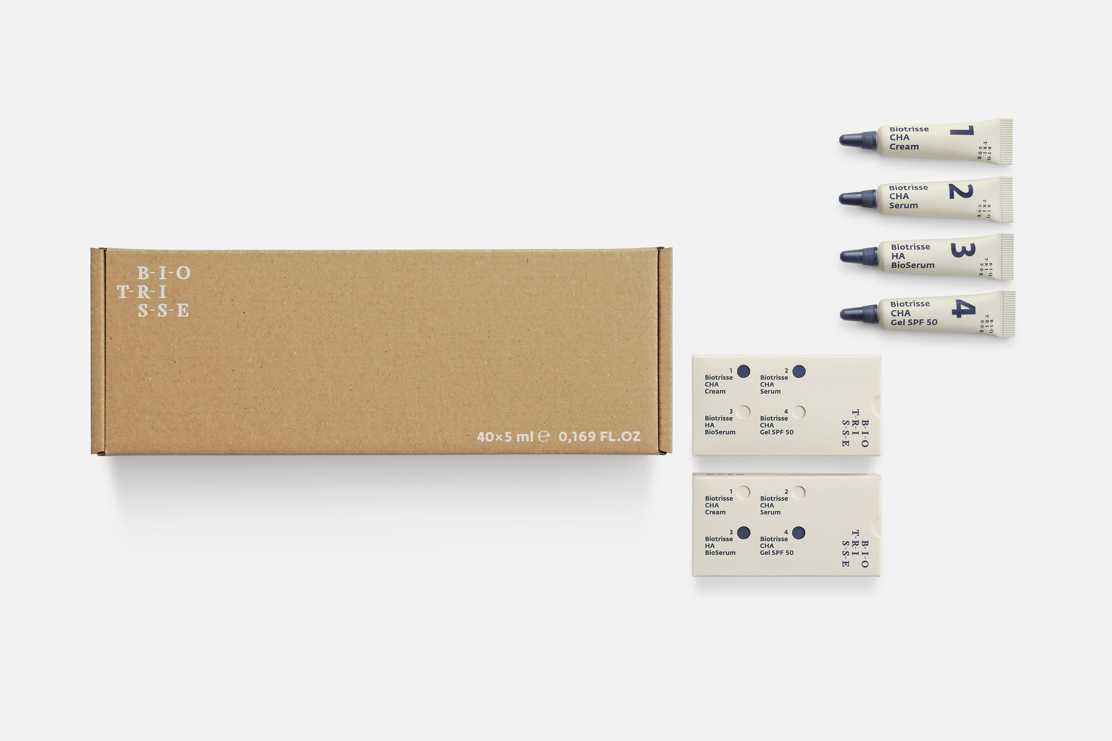
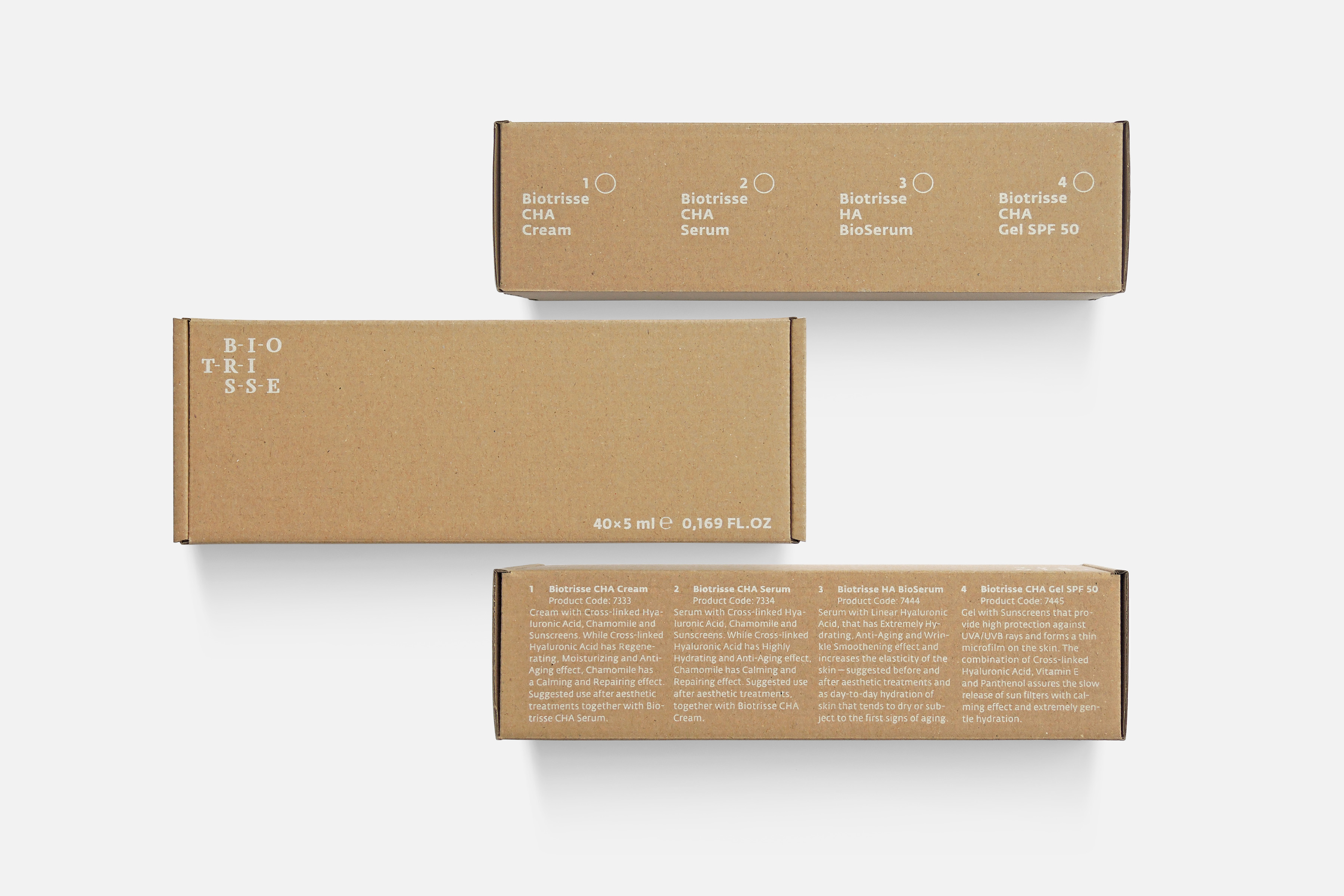
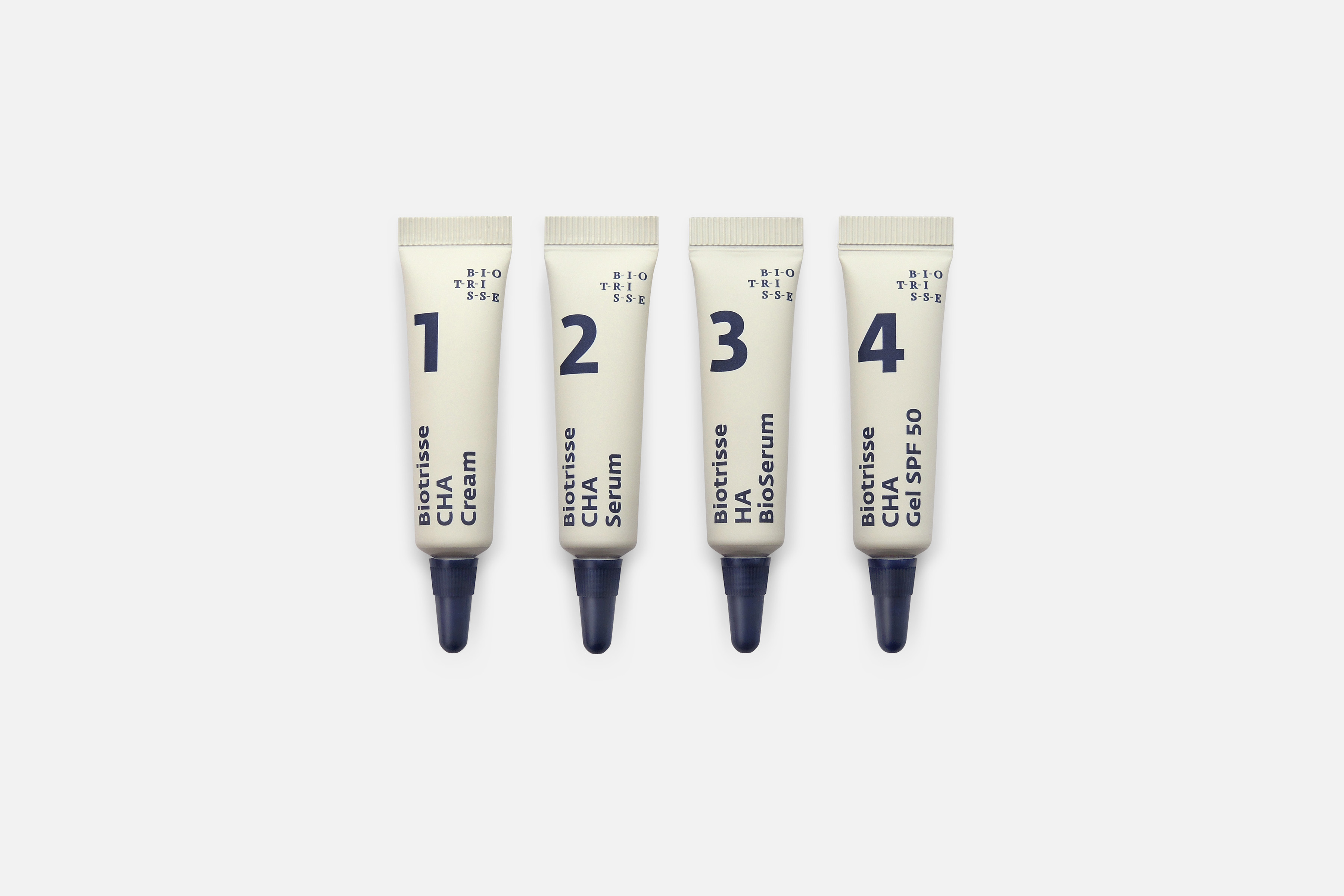
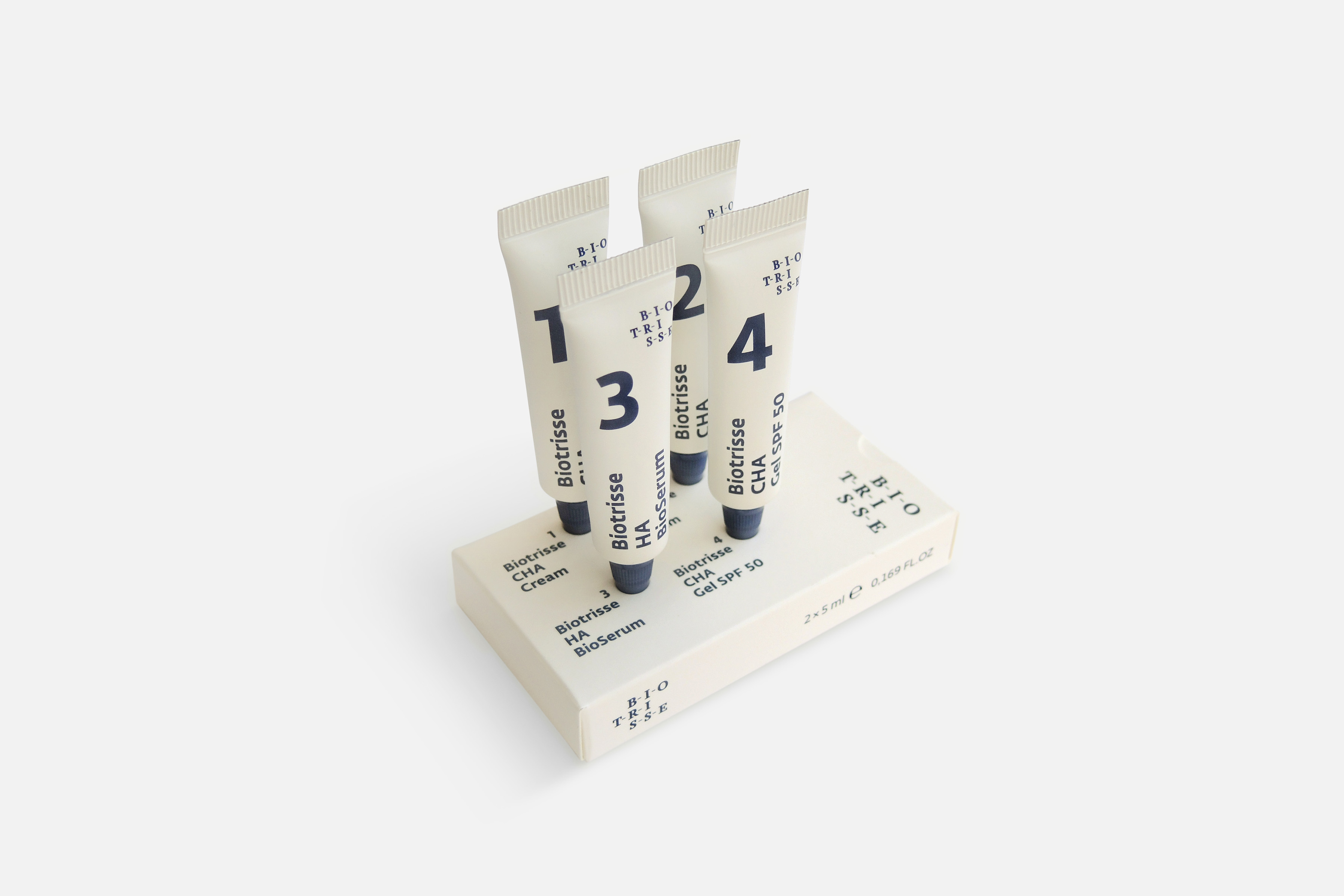
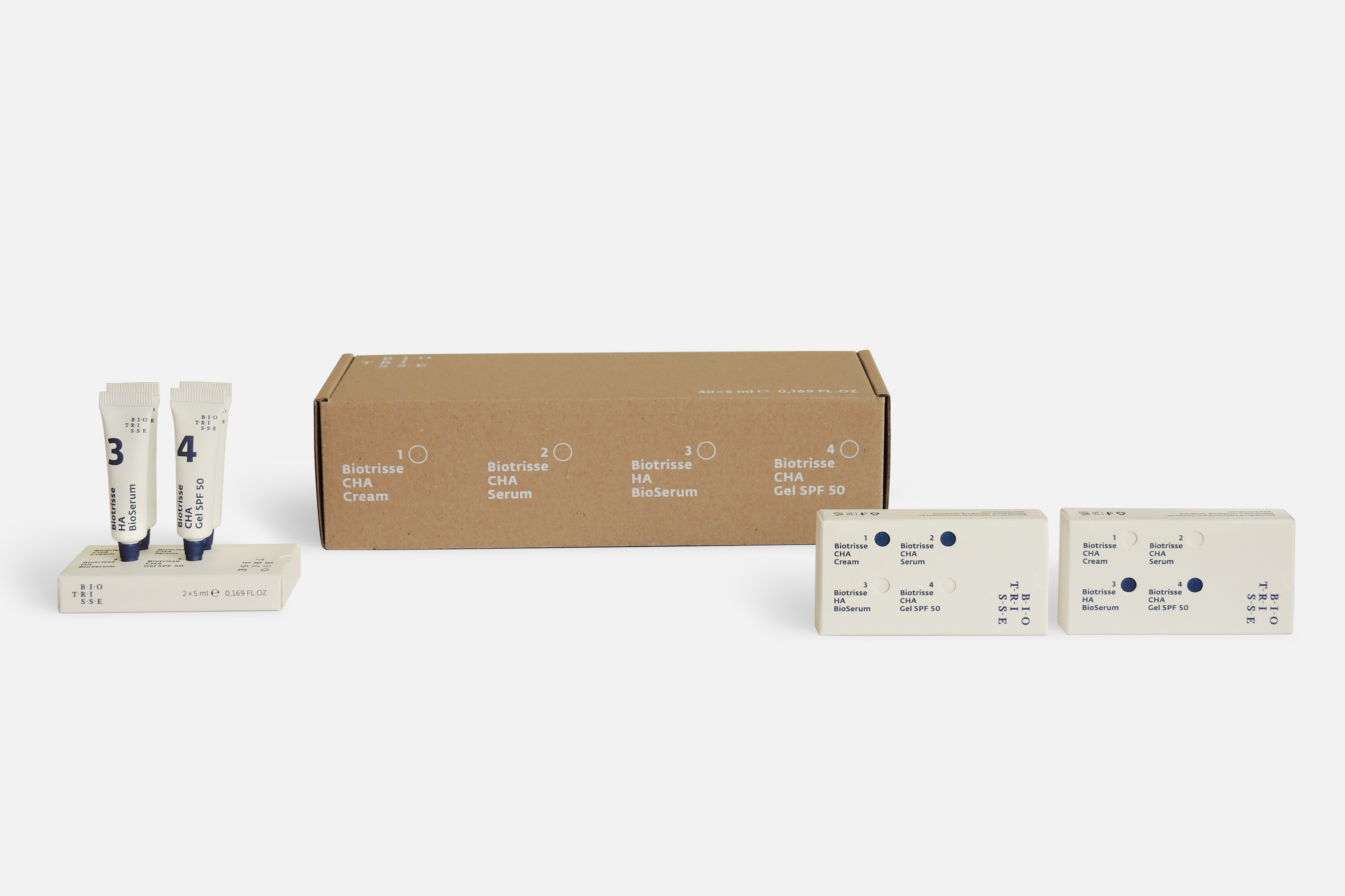
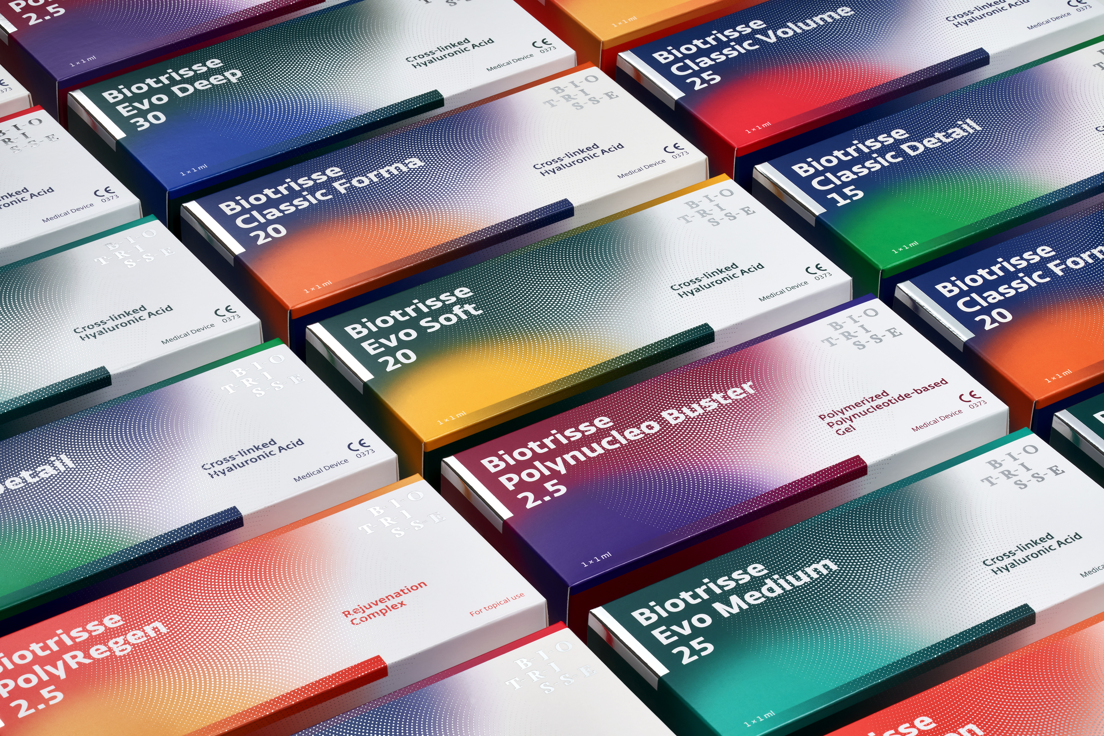
Вiotrisse Filler Cosmetics is a product line for face care. Four different types of creams are presented by a systematic approach for pre- and post- treatment, which consists of a certain sequence of uses. The main aim of packaging development was creating quick and easy recognition of the whole product line. According to that, besides product names on tubes, also ordinal numbers from 1 to 4 were used. Each box contains two tubes, grouped from one side, by type of using, from another, for marketing strategy.
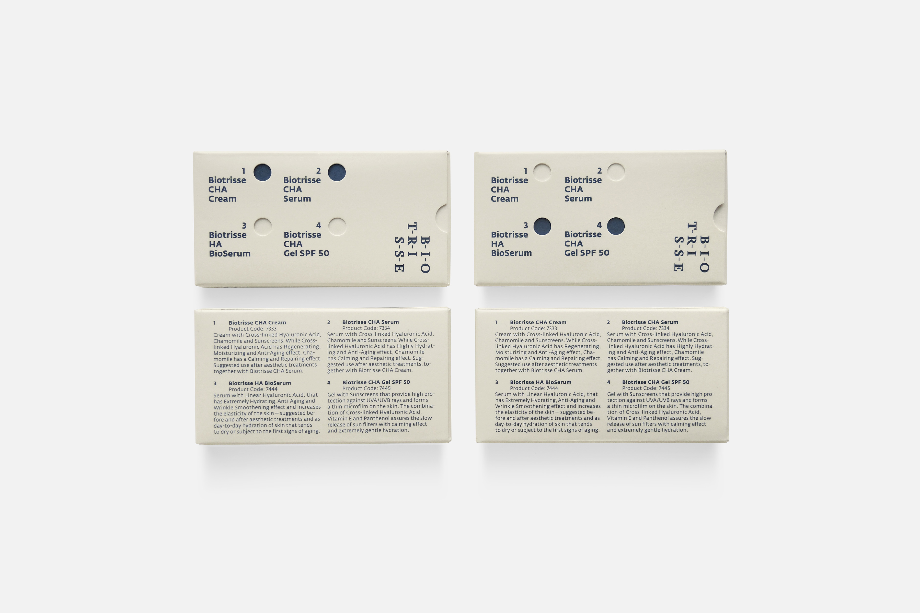
Outer boxes for 1/2 and 3/4 sets are absolutely the same. This feature is very useful for production. A difference consists in the inner tube holder. When assembled, printed parts of inner holders became visible through holes in the outer box. This identification allows us to see which cream set is packed inside. Moreover, the inner holder has an information leaflet function, where all mandatory terms of product use are printed. Customers not only have all cream tubes together, but also have the opportunity to take advantage of holes for using the box as a temporary stand for tubes as well.
Services Packaging
Client Вiotrisse AG
Project manager Beatrix Hidvegi
Production Hoffmann Neopac AG, Oberdiessbach, Switzerland
Print Sz. Varians, Budapest, Hungary
Typeface Fedra Sans
Year 2016
Awards Type Directors Club, New York (TDC63). Certificate
of Typographic Excellence
European Design Awards 2017. Gold Award
Red Dot Award 2017
German Design Award 2018. Winner
Type Directors Club Tokyo, Annual Awards 2018. Excellent Work