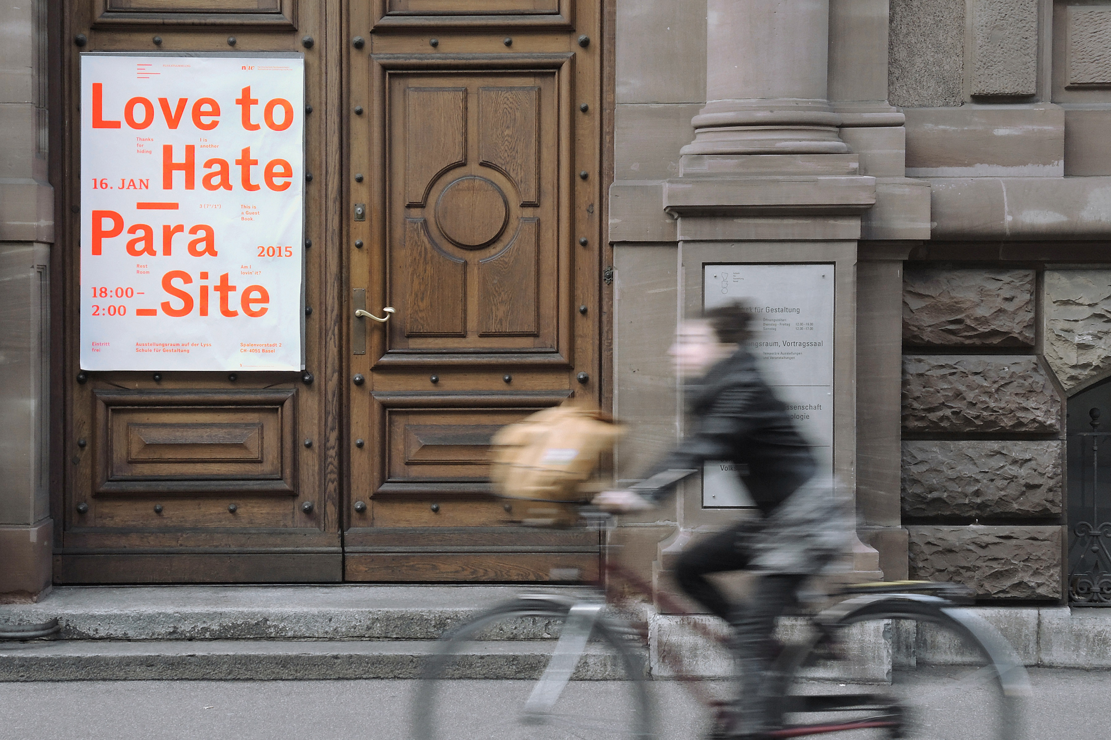
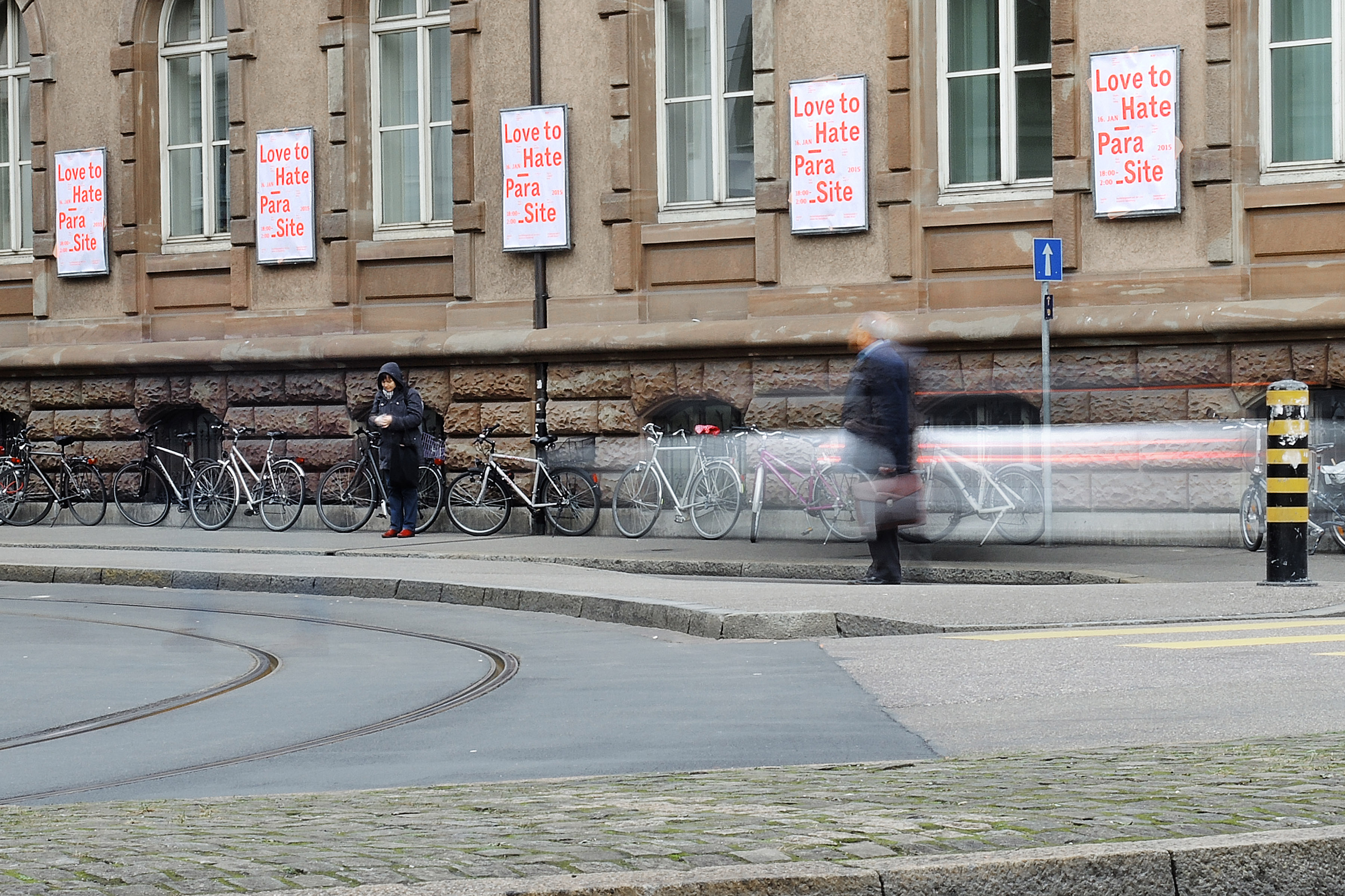
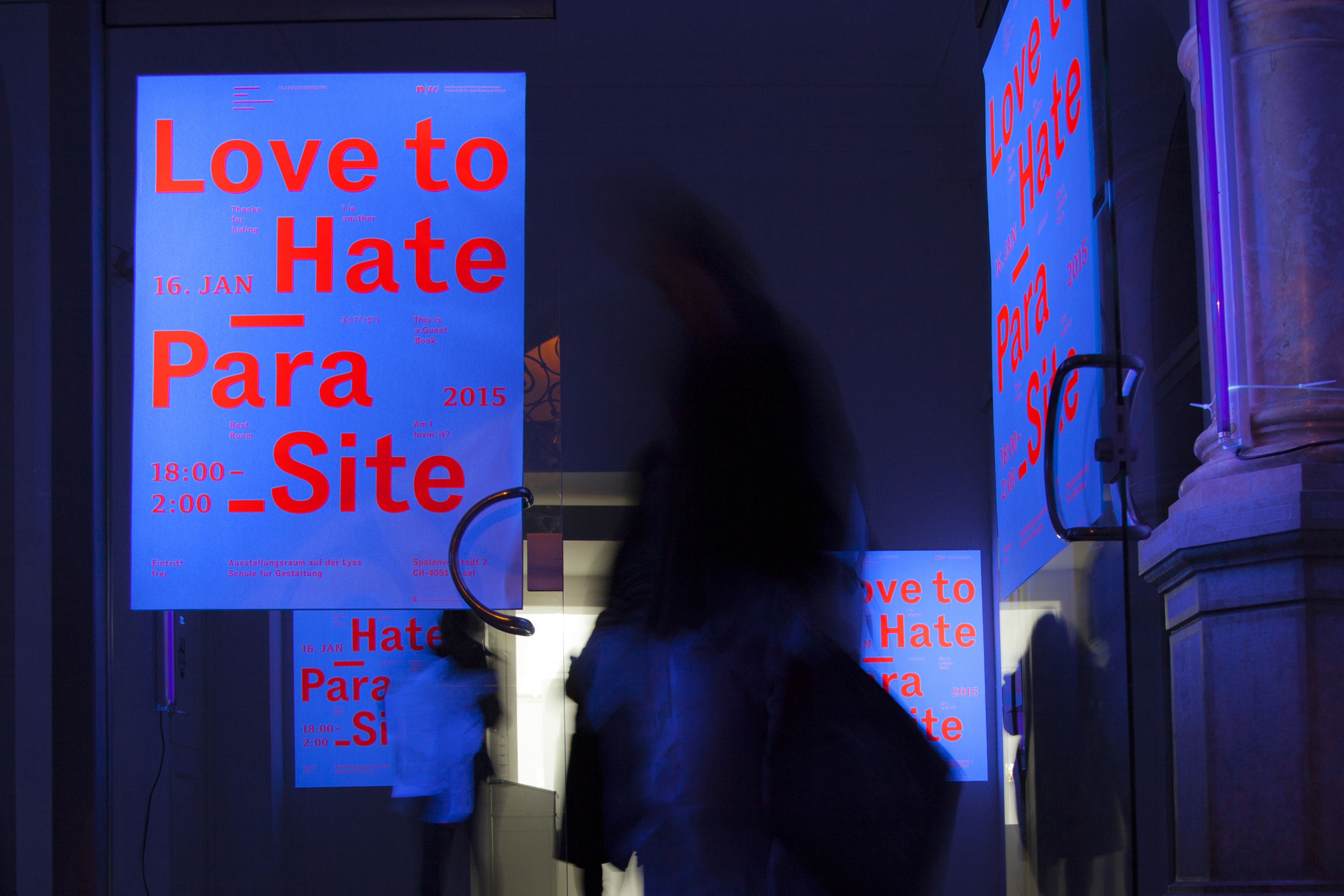
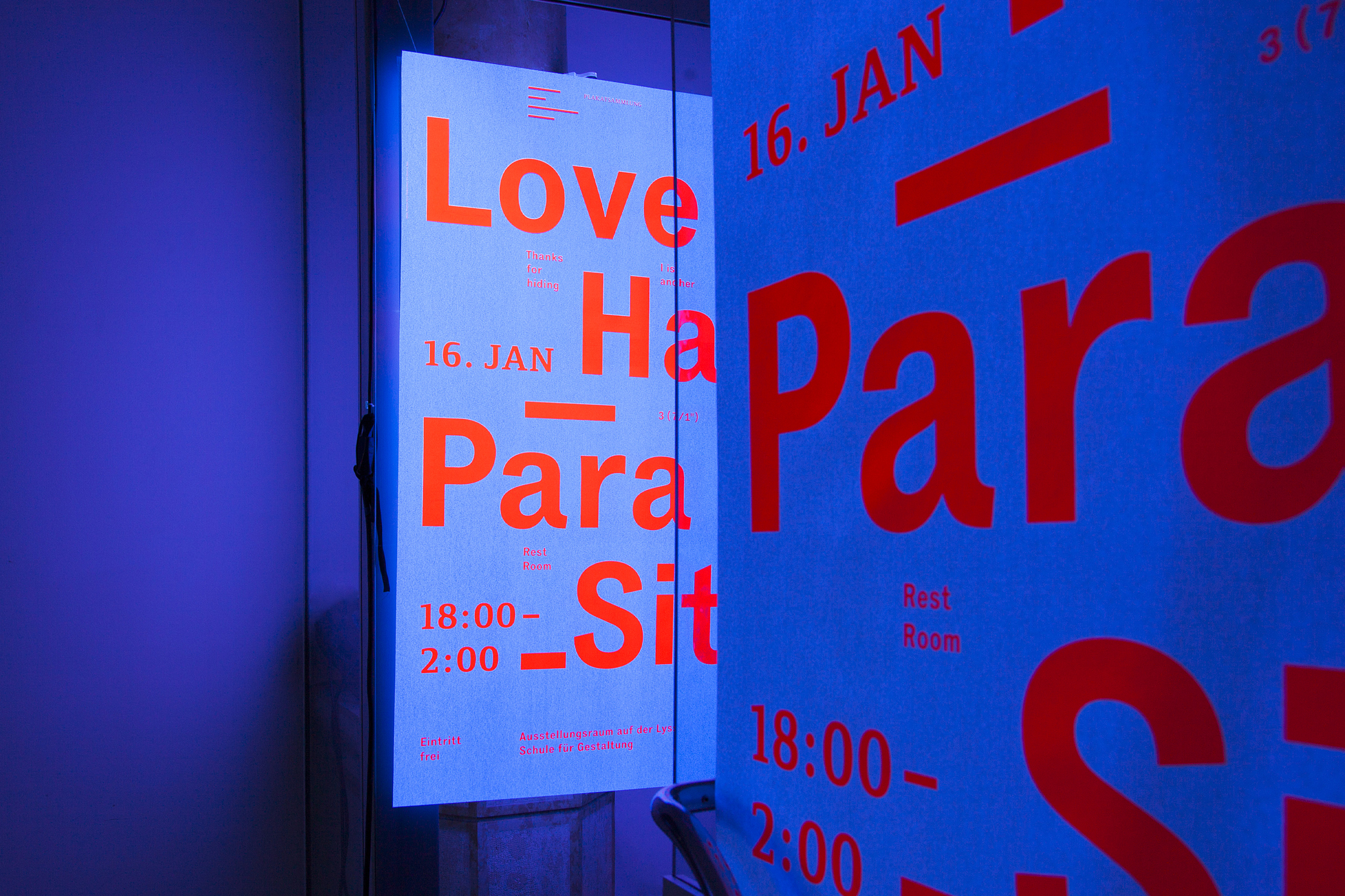
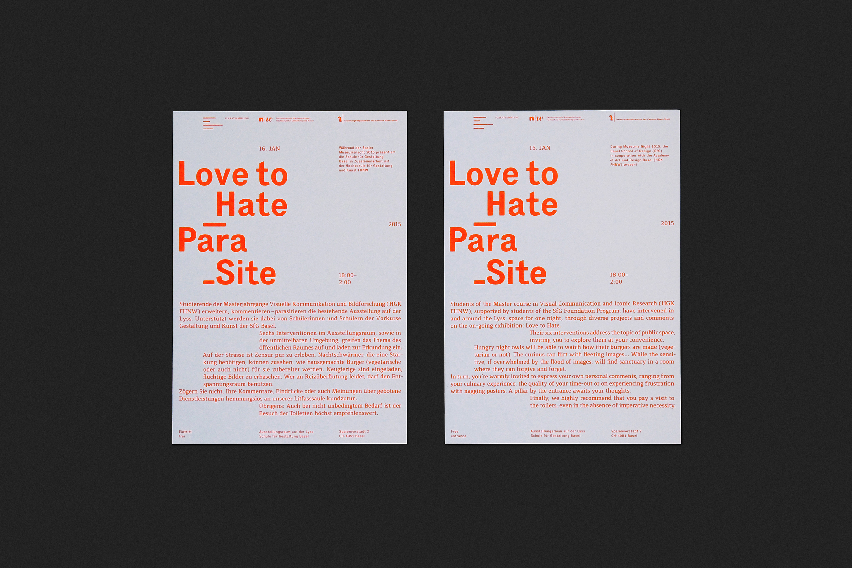
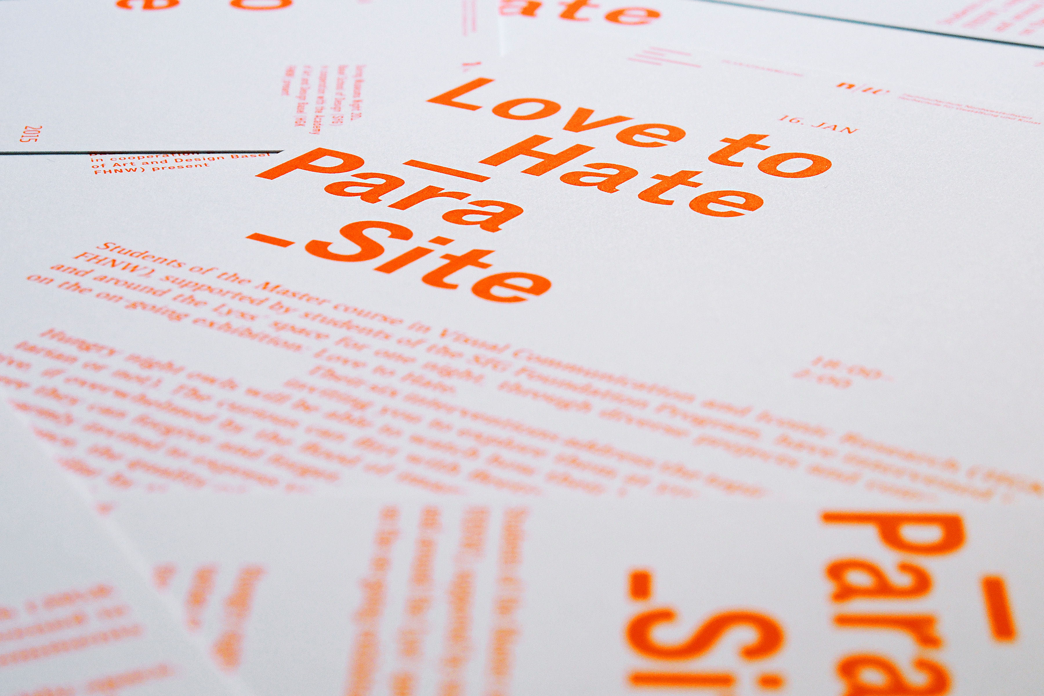
Visual identity for the museum night event Love to Hate – Para_Site in Plakatsammlung Basel. The design was developed from the simple idea of showing the same identity in different lighting conditions. The key visual is based on one-colour typography: it features a bright neon orange during the day, which changes completely at night when the poster is illuminated by UV lamps. The typographic approach is founded on a visual and metrical hierarchy, starting with bigger elements for the title and moving to smaller elements for more detailed information.
Services Poster Design, Event Design
Client
SfG Basel, FHNW HGK Visual Communication Institute, Plakatsammlung Basel
Curator Dr. Alexandra Schüssler
Typefaces Executive, FoundryFormSerif
Print Arni Siebdruck, Basel (silkscreen),
Steudler Press (offset)
Year 2014
Awards
European Design Awards 2015. Bronze Award
The International Typography Video Festival Typomania. Winner (movie about the printing process)
Red Dot Award 2015
iF Design Award 2016. Winner